Portland 50/50 Project App
UX/UI Case Study
As unique as Portland
The 50/50 Project needed an app that was as unique as the event for which it was made. I set out to make a visually interesting, intuitive experience that would be aesthetically appealing to a young audience but not too overwhelming for an older generation.
The 50/50 Project needed an app that was as unique as the event for which it was made. I set out to make a visually interesting, intuitive experience that would be aesthetically appealing to a young audience but not too overwhelming for an older generation.
It all starts with the user
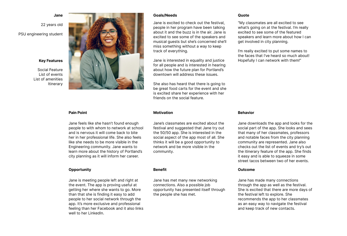
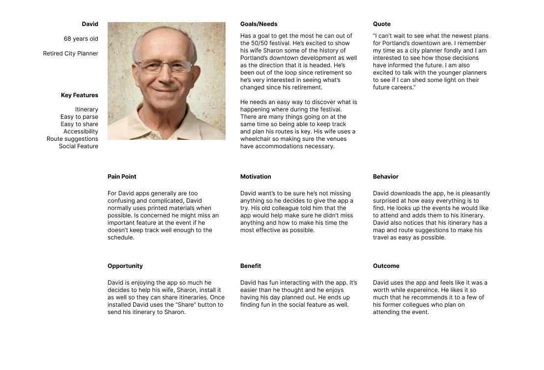
My client wanted to attract a wide age range to his event so making personas was key to getting a better understanding of these two demographics, their wants and needs, and where those things intersected.
My client wanted to attract a wide age range to his event so making personas was key to getting a better understanding of these two demographics, their wants and needs, and where those things intersected.
Best practices
I started off looking at what other events had been doing for UX/UI. I took note their best practices
as well as areas for improvement.
I started off looking at what other events had been doing for UX/UI. I took note their best practices
as well as areas for improvement.
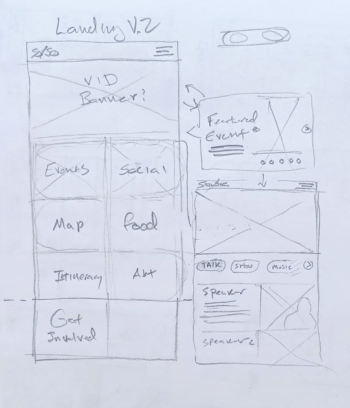
Time to sketch
I got to work planning out the look and feel of the app.
I got to work planning out the look and feel of the app.
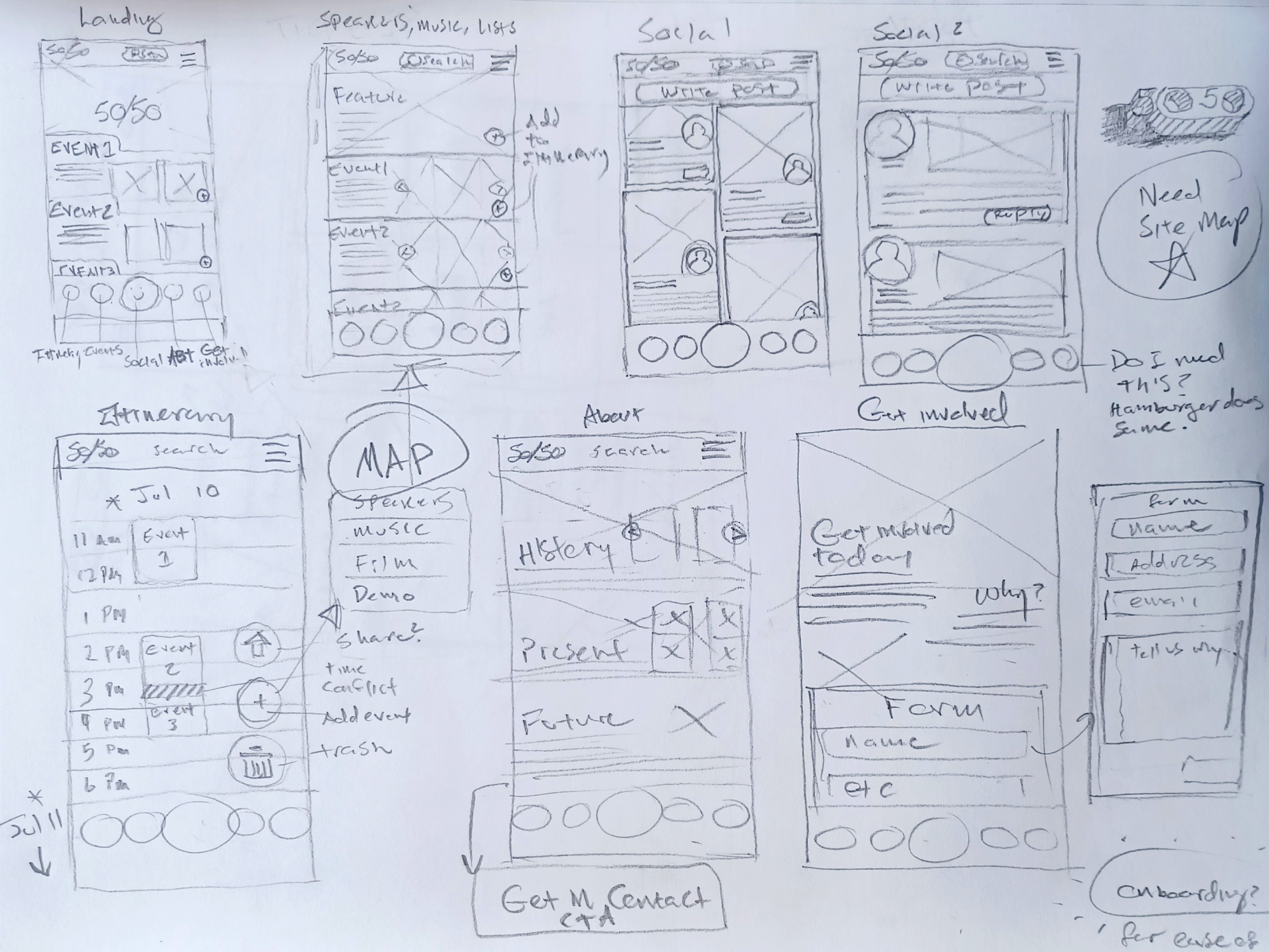
Site architecture
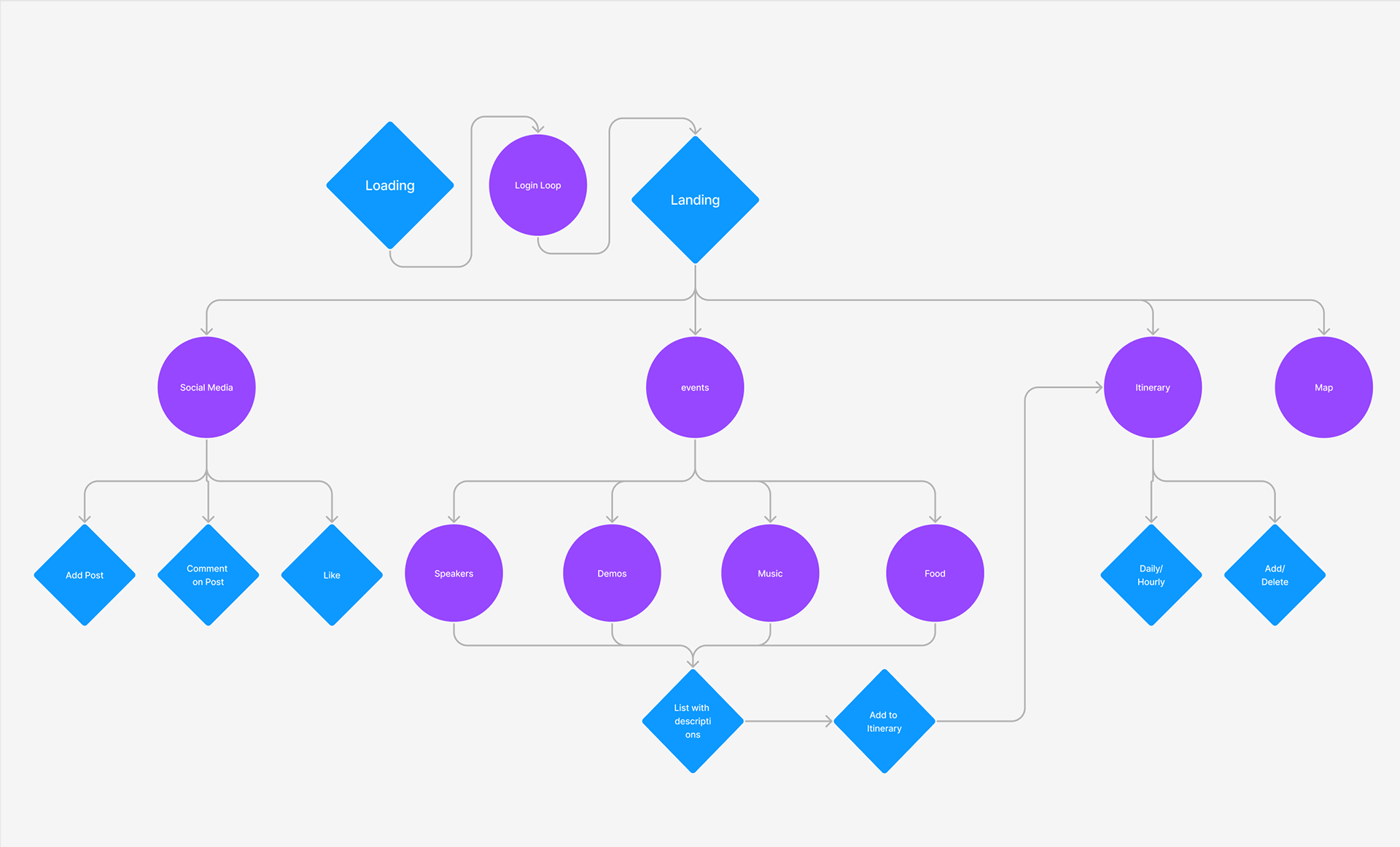
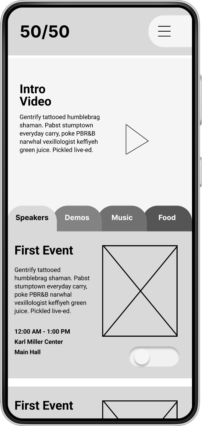
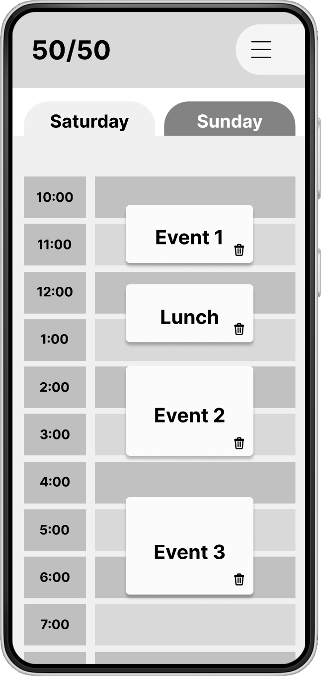
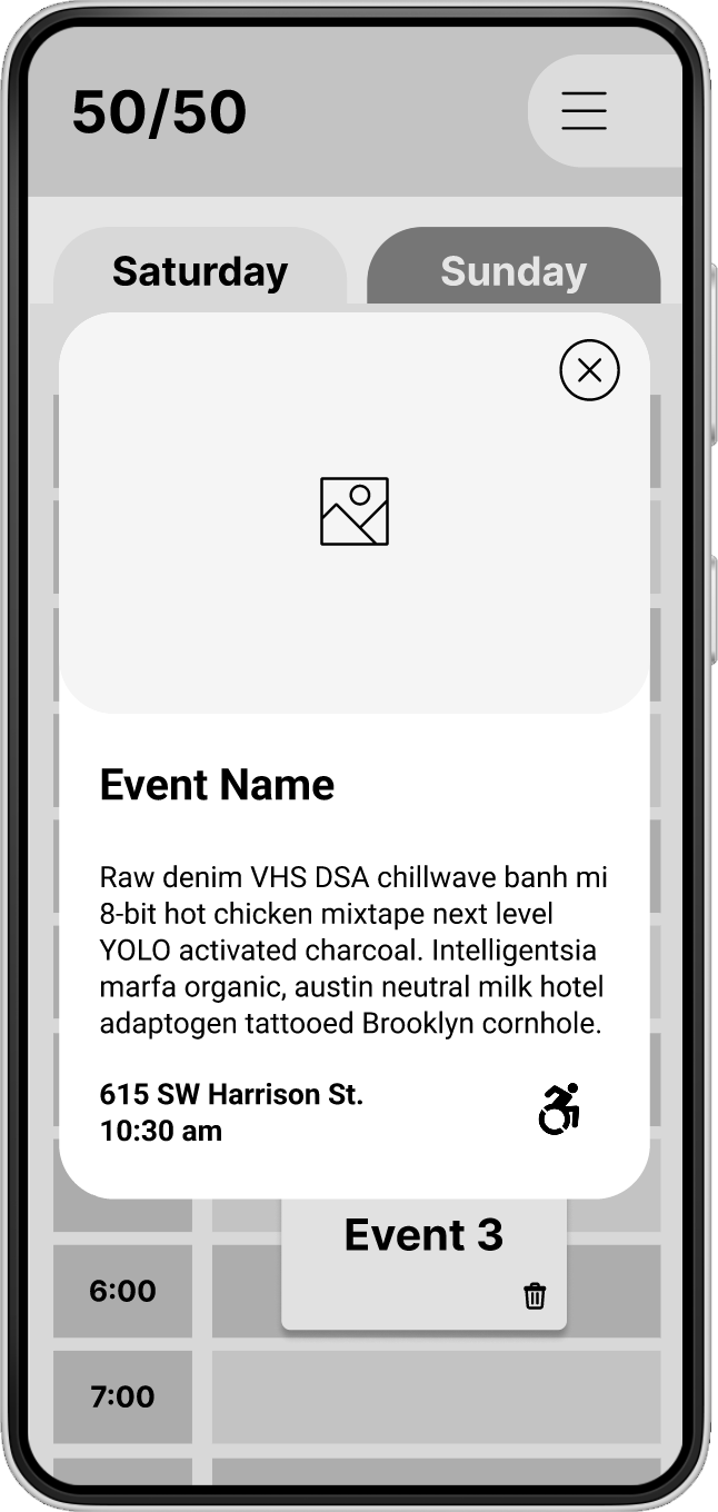
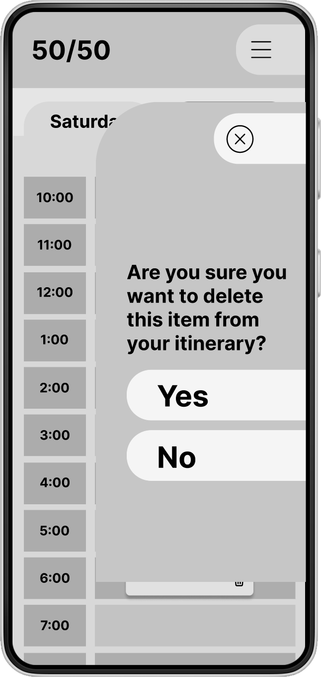
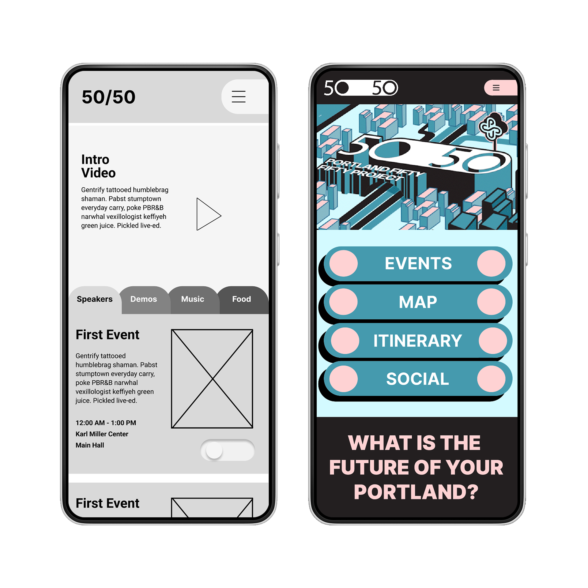
Wireframes
User testing and revision
After 10 people participated in testing the app I came away with a better understanding of their user experience and what improvements could be made. Below are some of the key takeaways and the changes they prompted.
After 10 people participated in testing the app I came away with a better understanding of their user experience and what improvements could be made. Below are some of the key takeaways and the changes they prompted.
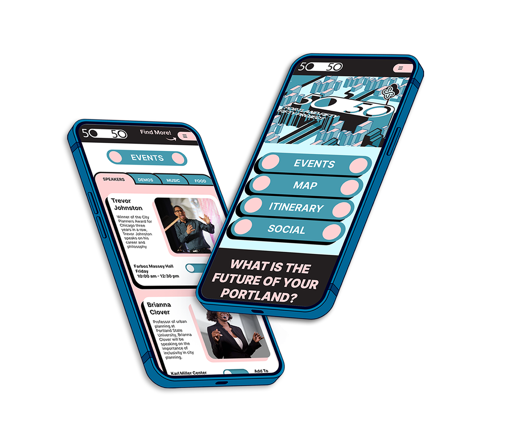
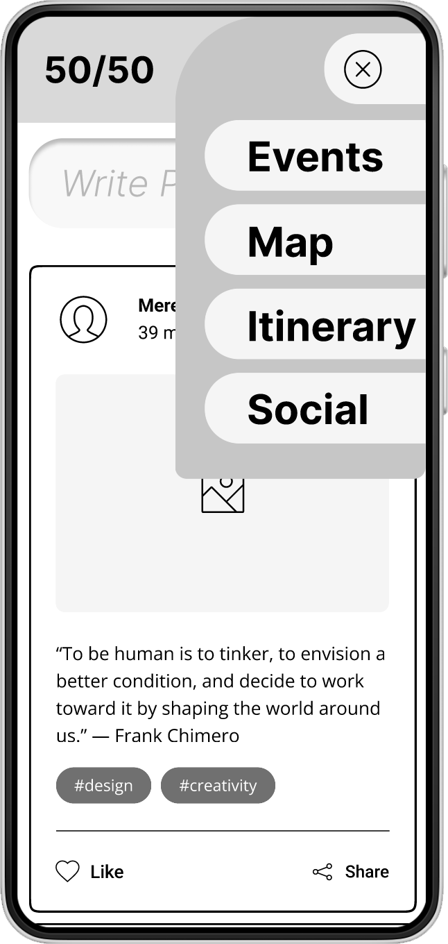
Clear landing page
Initially I assumed that people would go to the hamburger menu to find more parts of the app. I was wrong. Almost none of the participants got past the events page to see the other sections of the app. I decided that the most effective way to clear up this confusion would be to make a separate landing page that served as a hub for the other pages.
Initially I assumed that people would go to the hamburger menu to find more parts of the app. I was wrong. Almost none of the participants got past the events page to see the other sections of the app. I decided that the most effective way to clear up this confusion would be to make a separate landing page that served as a hub for the other pages.
A/B testing
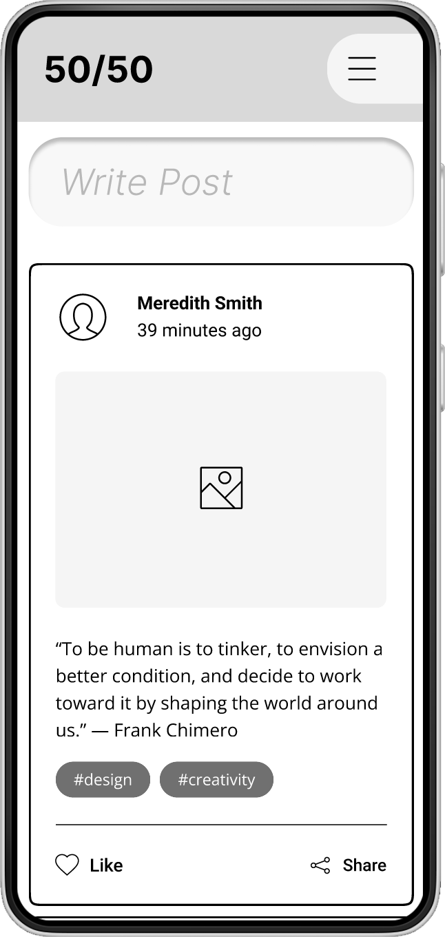
I used two versions of the social layout to see how users responded. 7 out of 10 people preferred the second version citing that they weren't immediately sure how to proceed with only the floating action button (FAB). The "write post" prompt made it clear how the user was supposed to move forward to add a post. Another critique was that the FAB covered up too much of the other UI and made things confusing for the some users.
I used two versions of the social layout to see how users responded. 7 out of 10 people preferred the second version citing that they weren't immediately sure how to proceed with only the floating action button (FAB). The "write post" prompt made it clear how the user was supposed to move forward to add a post. Another critique was that the FAB covered up too much of the other UI and made things confusing for the some users.

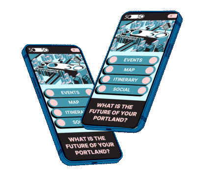
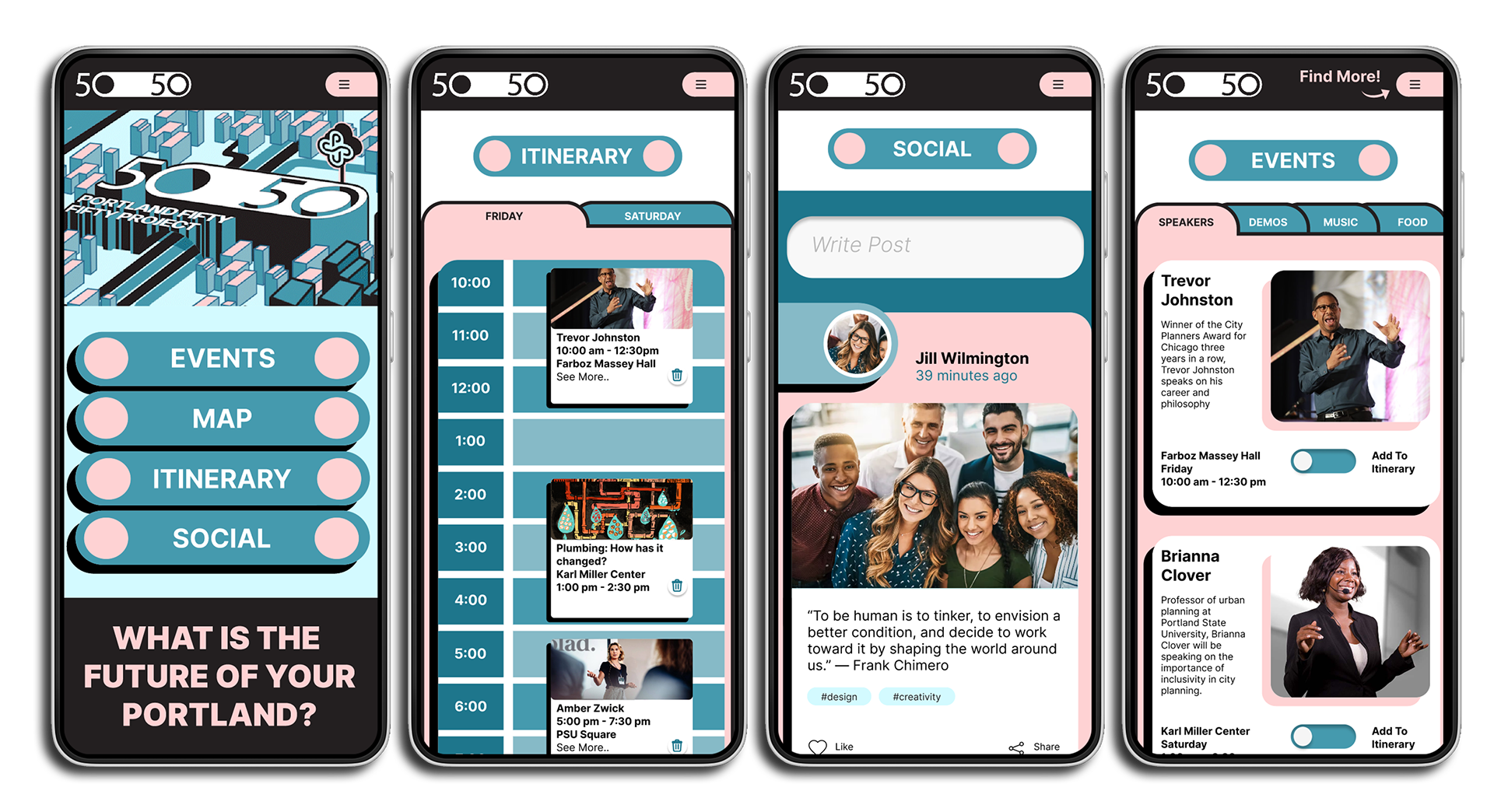
The final product
Thank you!